


RingConn Built V4 for the User They Want. Their Existing Community Is Letting Them Know.
RingConn V4 shipped to everyone last week. The redesign is real and the intentions are good. The community that bought the ring is telling them exactly what they got wrong.
RingConn V4 shipped to everyone last week. The redesign is real and the intentions are good. The community that bought the ring is telling them exactly what they got wrong.

RingConn V4 shipped to everyone last week, graduating from beta to a full App Store release. The redesign is real, the intentions are good, and the community that has been wearing RingConn hardware for the past two years is not happy about it.
The top post on r/RingConn right now is titled "I hate the new app design" with 100 upvotes and 77 comments. Separate threads are asking where exercise tracking went, where the stress emoji went, where blood pressure monitoring went, why the font looks childlike, and whether anyone from RingConn actually reads these posts. One user has already sent three feedback messages through the app. Another is exporting their data to Excel because the app no longer surfaces the raw numbers they want.

This is not a typical "change is hard" user backlash. The complaints are specific, consistent, and point to a real product strategy tension that V4 did not resolve.
What the Community Is Actually Saying
The loudest complaint is navigation. V4 moved a significant amount of functionality into the Discover tab: exercise logging, menstrual and women's health tracking, sleep apnea data, and workout session recording all live there now. The information is still present. But in the old app, it was on the first screen or one tap away. In V4, you need to know where to look.
The subreddit has become an informal support channel as a result. Thread after thread follows the same pattern: someone asks where a feature went, another user answers "Discover tab," the original poster thanks them. The answer is always the same. People keep needing it. That is a discoverability problem, and it is entirely self-inflicted.
Exercise logging attracted its own specific complaint: you can no longer log a workout for a previous day. The option only shows today's date. For anyone who forgot to log before updating, that data is just gone. Small oversight, outsized frustration.
The women's health criticism cuts deeper than a navigation complaint. Moving menstrual cycle tracking off the main Insights page and into Discover read to several users as deprioritizing women's health data relative to everything else. One user put it plainly: "Way to alienate half your customer base immediately." Another said menstrual tracking was specifically why they bought the ring. Whether RingConn intended that signal or not, the signal landed.
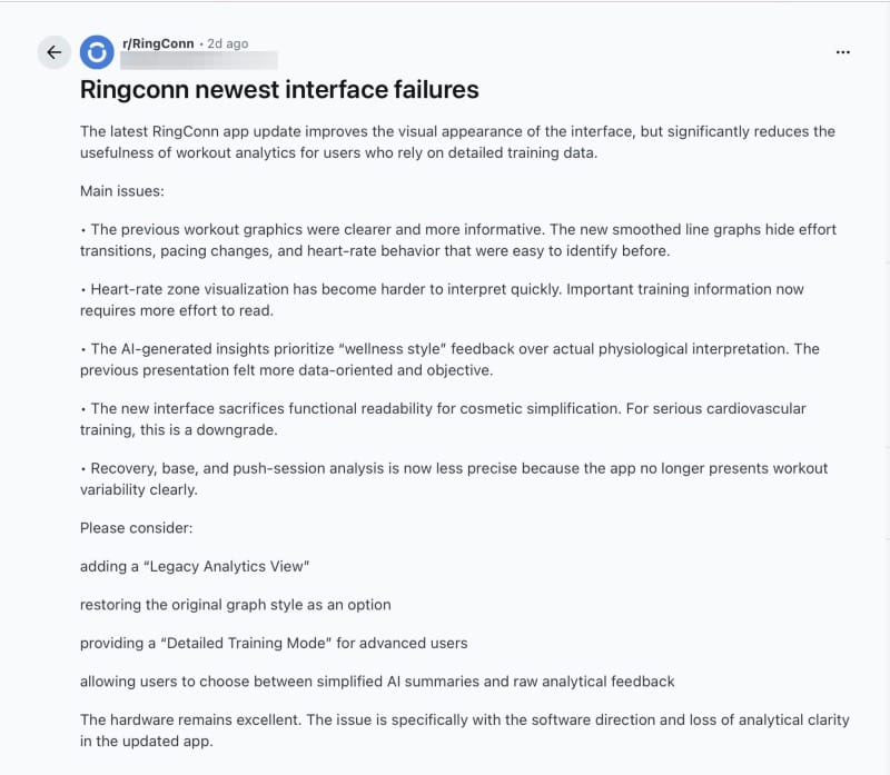
Power users who rely on workout analytics raised a separate set of objections. The previous workout graphics showed effort transitions, pacing changes, and heart rate zone detail in a way that serious training relies on. V4's smoothed line graphs look cleaner and communicate less. One detailed post catalogued the specific data that got harder to read: heart rate zone visualization, recovery and push session analysis, workout variability. The post's recommendation was a "Legacy Analytics View" option or a "Detailed Training Mode" for advanced users. The underlying ask: let people choose their level of data density.
The stress redesign also took a hit. The smiley face slider that V4 replaced was genuinely liked, it turns out. "I want my life face icon to show me how calm or stressed I am. They made it more complicated." Thirty-five upvotes on that one. The new arc visualization is objectively cleaner. But the smiley communicated emotional state at a glance in a way the arc does not, and casual users noticed the loss.
There are positive voices. "It looks a lot better, doesn't feel outdated now." "I like what they did with the Activity section." A few people appreciate the coaching language and the cleaner first impression. They exist. They are outnumbered.
The Design Decision That Created This
It is worth pausing on something the subreddit reaction glosses over. V3, the interface people are now defending as the good version, was itself a major overhaul. The users calling for it back had to adapt to it too, at some point. The app that felt intuitive and familiar this week was once the new thing that replaced something else. RingConn has now done this twice in a relatively short period, and the pattern is instructive: each redesign optimizes for a new audience, the existing community absorbs the disruption and adapts, and then the cycle repeats. The frustration with V4 is real, but some portion of it is the friction of disruption rather than evidence of genuine regression. The question is whether RingConn has given their existing users enough reason to go through that adaptation again.
V4 was built around a specific thesis: most users do not want raw data, they want to know what the data means. The interpretation layer, the plain-English status headlines, the "Rough night?" coaching copy, the color-coded health domains: all of that reflects a deliberate decision to make the app approachable for someone who just bought a smart ring and has no idea what HRV means.
That is not a wrong decision. The smart ring category still skews toward early adopters, but it is growing toward mainstream users. An app that leads with a 31ms HRV reading and an SpO2 chart loses that audience before they understand why the data matters. The V4 redesign solves a real problem.
The problem is that solving for the new user came at a measurable cost to the existing one. Features that power users accessed in one or two taps now require navigating a tab they did not previously use. Data density was reduced in the name of visual clarity. The smiley face, whatever its analytical merit, was a quick emotional anchor that people had integrated into their morning routine, and it is gone.
RingConn does not appear to have built a way for users to choose between these modes. There is no "detailed view" toggle. There is no data-density setting. You get the V4 experience, and that experience was optimized for someone other than the person who has been wearing the ring for 18 months.
Where This Lands as Gen 3 Hits the Market
The Gen 3 ring shipped May 29, the same week this reaction was playing out on the subreddit. V4 is the platform it launched on. For new buyers coming in through Gen 3 marketing, V4 will feel polished and welcoming. That is the right first impression for hardware trying to push past the early adopter ceiling.
But RingConn now has an existing user base that is vocal, engaged, and frustrated. The subreddit is not a fringe. These are people who bought in early, who filled out the UI surveys that informed the redesign, who were on the beta, and who are now posting that they "hate" the result. That is a retention signal worth taking seriously regardless of what Gen 3 does for acquisition.
The fix is not to revert the redesign. V4 is better for casual users and it will serve Gen 3 buyers well. The fix is to give power users their data back without making them look for it. A density toggle, a legacy analytics option, bringing exercise logging back to a more accessible path, restoring past-date workout entry. None of those require abandoning the new design language. They require acknowledging that the people who have been wearing RingConn hardware the longest are not the same people the new interface was designed for, and that both deserve to be served.
RingConn took user feedback seriously enough to redesign the entire app. The community is betting they'll listen again. There's one more detail worth sitting with: RingConn's own Gen 3 marketing pitches it as being built for users who want more than passive data collection, emphasizing long-term pattern interpretation over isolated wellness numbers. The community they already have is asking for exactly that. The irony is that the people most likely to care about what Gen 3 promises are the same people who feel like V4 took it away.
Previously: For a detailed breakdown of what changed in the V4 redesign with side-by-side screenshots, see the original coverage: RingConn's V4 App Is More Than a Redesign: It's a Health Strategy Shift
Read us first
See more TBTL when you search Google
Add Tech Between the Lines as a preferred source and our Apple coverage shows up more often in your Top Stories. It takes one tap, and you can change it anytime.
Prefer TBTL on Google