macOS 27 and the Quiet Work of Getting Liquid Glass Right
A year of user frustration, a hardware mismatch hiding in plain sight, and a design team course-correcting the right way.

There’s a version of this story where Apple’s macOS 27 redesign reads as a retreat. A year ago at WWDC 2025, the company announced Liquid Glass with the kind of confidence it reserves for things it believes will define the next decade. In Apple’s official press release, Craig Federighi called macOS Tahoe’s new aesthetic a “gorgeous new design.” On the WWDC keynote stage, Alan Dye, Apple’s VP of Human Interface Design, went further, calling it the company’s “broadest software design update ever.” The press called it Apple’s most significant visual overhaul since iOS 7. And it was; genuinely striking, translucent surfaces catching and bending the colors of whatever sat behind them, a design language pulled straight from visionOS and pushed across every Apple platform at once.
Then people actually used it.
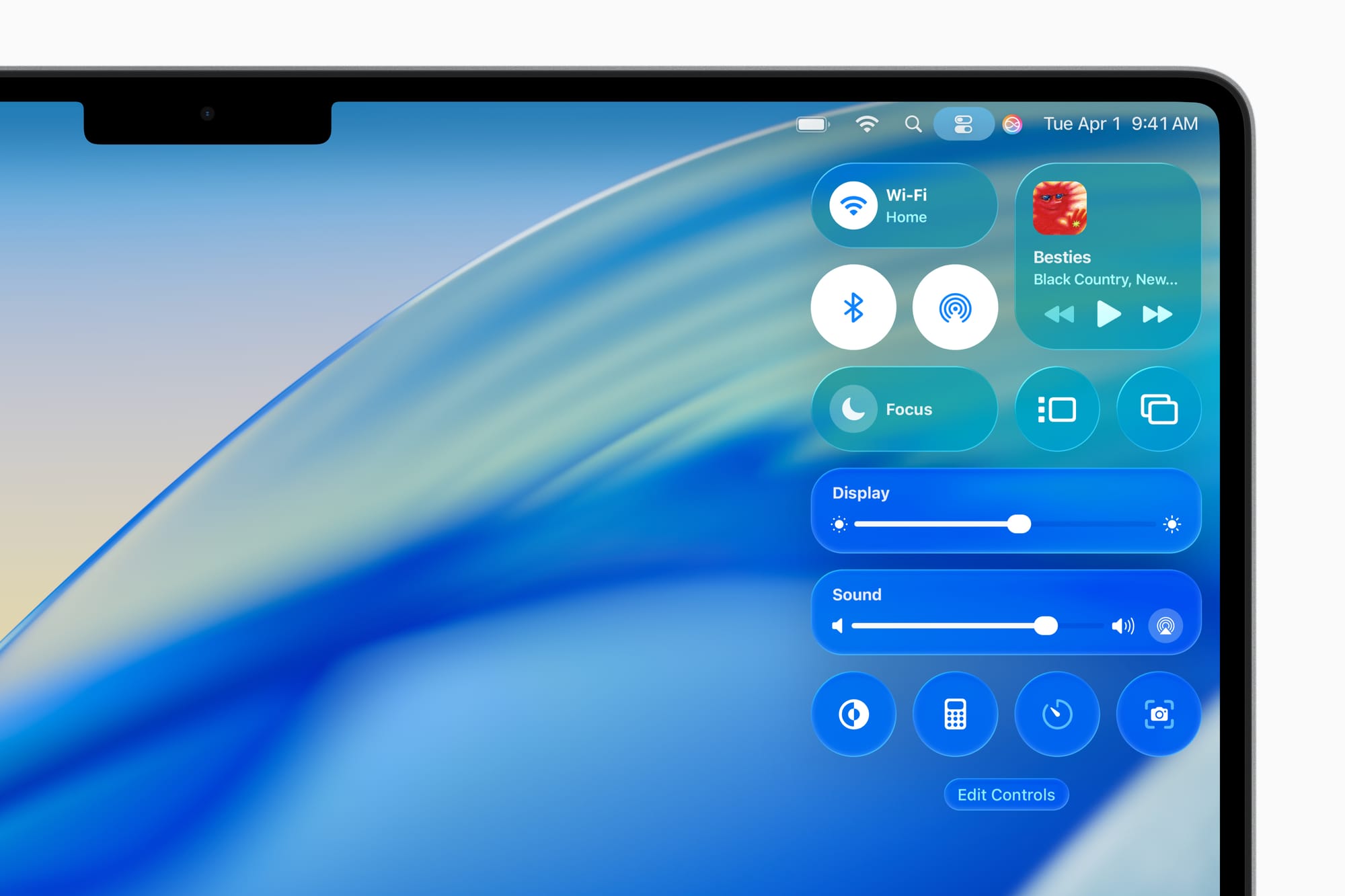
Within weeks of macOS Tahoe shipping last September, the feedback settled into a consistent pattern. The Finder sidebar was muddy. Control Center looked foggy. Mail and Notes, two apps people spend hours reading text inside, were harder to parse than they had been in years. The transparency effects and shadows that looked pristine in Apple’s keynote demos turned soft and ambiguous on the LCD panels inside most Macs, blurring the line between interface and wallpaper in ways that made basic tasks feel slightly more effortful than they should.
Now, ahead of WWDC 2026, Bloomberg’s Mark Gurman reports that macOS 27 will bring a “slight redesign” targeting the “shadows and transparency quirks” that defined the Tahoe experience for so many users. Liquid Glass itself stays. The design language isn’t being abandoned, and Apple reportedly remains committed to it as a central part of its platform direction. What’s changing is the implementation: tighter control over opacity, better-managed contrast in text-heavy areas, shadows that clarify rather than obscure.
That’s the brave move. And it deserves more credit than it’s getting.
The Problem Was Always Hardware, Not Design
To understand why macOS 27’s corrections matter, you need to understand why Tahoe struggled in the first place. Liquid Glass was conceived with OLED displays in mind. The iPhone’s OLED panel produces true blacks (pixels that are simply off) which means that a translucent surface has an absolute dark anchor to work against. Glass effects on an OLED look deliberate because the contrast beneath them is absolute. The blur is clean and the depth is real.
LCD panels work differently. The backlighting is always on, pushed through a filter rather than switched off per-pixel. When you apply the same translucency and shadow logic to an LCD Mac, those effects land in a lower-contrast environment, and the result is an interface that reads as slightly out of focus rather than intentionally layered. That’s not a perception problem or user error; it’s physics.
The readability issues weren’t universal across macOS Tahoe, they concentrated in specific, predictable places. Control Center, where icons and toggles need to be distinguished instantly. The Finder sidebar, where a column of files and folders demands clear typographic contrast. Apps like Mail and Notes, where hours of reading at a desk make contrast fatigue a real thing. These are precisely the surfaces where a designer would have caught the LCD mismatch early if the design had been tested as rigorously on Mac hardware as it was on iPhone.
It apparently wasn’t.
Apple’s own internal framing of the Tahoe situation describes it as “a not-completely-baked implementation from Apple’s software engineering team” — meaning the design intent was sound, but the execution didn’t fully account for the hardware variance. The goal of macOS 27’s design work is to deliver Liquid Glass “the way Apple’s design team intended it from the start.”
That’s a specific and meaningful distinction.
What iOS 7 Actually Teaches Us Here
The reflexive comparison being made across tech media right now is to iOS 7; Jony Ive’s flat design overhaul that shipped in September 2013 and immediately divided users. The parallel is obvious: Apple introduces a sweeping visual redesign, the world reacts with a mix of admiration and frustration, and the following release sands down the roughest edges. Pattern recognized.
But the comparison, examined closely, actually makes the case for what Apple is doing with macOS 27, not against it.
iOS 7 was a complete departure. The skeuomorphic textures and visual metaphors of the Steve Jobs and Scott Forstall era replaced wholesale with something stark, flat, and in its earliest form, occasionally hard to navigate. The backlash had real substance. Buttons that used to look like buttons no longer did. Text-only controls had smaller tap targets. Contrast in some areas dropped to levels that accessibility researchers criticized on publication day. It took iOS 8 — and arguably iOS 9 — to fully resolve the interaction problems that the original redesign introduced.
Liquid Glass is not iOS 7. The underlying interaction model of macOS Tahoe didn’t change. The controversy has been about a single dimension of the implementation: readability. Not the concept, not the direction, not the depth and layering that Liquid Glass is genuinely capable of at its best. The surface. Literally. The rendering of glassy surfaces on hardware that wasn’t the primary target of the design.
That’s a narrower, more solvable problem than iOS 7’s. And the fact that Apple is solving it in version two, rather than letting it linger into version four, is worth acknowledging.
The Discipline of Not Starting Over
There’s a reflex in both design culture and tech journalism that treats revision as failure. If you have to change something you shipped, the implicit argument goes, you either lacked conviction or shipped something broken. Neither label is quite fair to what’s happening here.
Great design is iterative by nature. Not because good designers can’t get things right the first time, but because the real-world conditions under which design is experienced are never fully predictable in advance. A mockup renders identically on every display it’s viewed from. A shipping product runs on twelve different Mac models with three different panel technologies, held at varying angles, under office fluorescents and afternoon sun and the blue glow of a bedroom in the dark.
The macOS 27 changes target opacity behavior so that interface elements, particularly text and icons, maintain better contrast against glassy backgrounds. That is design doing what design is supposed to do: responding to what the real world reveals. The discipline isn’t in getting everything perfect before shipping. It’s in accurately diagnosing what the real world exposed, then fixing it cleanly without overcorrecting.
Overcorrecting would mean abandoning Liquid Glass entirely. Retreating to the flat, low-ambition aesthetic that large portions of the design community have been quietly pushing Apple toward for years would be the actual failure. A design language retreated from under pressure is a design language whose vision was never fully believed in. The choice to correct the implementation while holding the concept is, from a craft standpoint, the harder path.
What macOS 27 Needs to Get Right
There are two things the macOS 27 Liquid Glass refinements need to accomplish on Monday, and they’re not the same thing.
The first is purely functional. The Finder sidebar needs to be readable under standard office lighting on a MacBook Air. Control Center needs to allow instant, glanceable access to the controls it contains. Text-heavy apps need to stop competing with the desktop for the user’s attention. These are not aesthetic preferences; they’re baseline usability requirements that Tahoe failed to fully meet on LCD hardware. If macOS 27’s adjustments don’t clear this bar, nothing else matters.
The second is subtler. The refinements need to demonstrate that Liquid Glass has a coherent future that it’s a design language with room to grow rather than a concept that only works under ideal conditions. OLED MacBooks are coming. A touchscreen MacBook is reportedly expected as soon as late 2026, and when OLED panels arrive on Mac hardware at scale, Liquid Glass will look the way it was always meant to. The macOS 27 work is the bridge, the version that makes the design livable on current hardware while the hardware catches up to the vision.
Gurman’s framing is that the code cleanup and refinement effort is a theme across all the new operating systems this year, not just macOS 27. That’s encouraging. It suggests Apple is treating this as a platform-wide commitment to polish rather than a cosmetic patch applied to the most visible complaint. Platform-wide polish compounds over time while a single cosmetic fix fades.
The Harder Question
Here’s what Monday’s keynote won’t fully resolve: whether the readability problems of macOS Tahoe were a failure of process or a failure of judgment.
A process failure means the right design was insufficiently tested on the hardware it needed to work on. That’s correctable. macOS 27 corrects it. Move forward.
A judgment failure would mean that someone in Apple’s design pipeline knew the LCD rendering was suboptimal, and shipped anyway, betting that users would adapt, or that OLED Macs would arrive quickly enough to make the issue moot. That’s a more troubling scenario, not because the result looks any different, but because it reflects a culture that prioritized announcement over experience.
The evidence available right now doesn’t clearly answer that question. What it does show is that Apple’s internal teams are describing the macOS 27 changes as arriving at the design the team originally intended, which points toward process rather than judgment. Whether that framing is accurate or retrospectively convenient is something only people inside the company know.
What we can evaluate is the outcome. And on that front, choosing to refine rather than retreat is the right call. Liquid Glass, at its best — on the right display, in the right conditions, with opacity handled with care — can be genuinely beautiful. More than that, it’s an interface language that makes sense for where Apple’s hardware is headed.
Killing it because the first implementation struggled on LCD panels would have been a decision made for the wrong reasons.
macOS 27 will be previewed at the WWDC 2026 keynote on June 8 at 10:00 a.m. PT, streaming live via Apple’s website and the Apple Developer app.