

Somewhere Between iPhone and iPad, the Duo Found Its Own Place.
Apple's foldable doesn't stretch iOS or shrink iPadOS. It moves the controls to the side, and that choice will define the first year of living with it.


Every foldable maker eventually hits the same fork in the road. You can take your phone software and stretch it across the bigger screen, or you can take your tablet software and squeeze it down. Both paths are convenient to ship and awkward to use. With the iPhone Duo, Apple picked a third option, and it may be the most interesting interface decision the company has made since the original iPhone dropped the keyboard.
The Duo opens for pre-orders on October 16 and arrives October 23, with a starting price of $1,999. Hardware reviews will fixate on the hinge and the crease, but the software deserves equal scrutiny, because Apple rewrote some of the oldest rules in iOS to make this device work.
Two screens, one shape
The foundation is a geometry choice. The 5.4-inch outer display and the 7.6-inch inner display share the same aspect ratio, so content scales up or down without reflowing into a new arrangement. Closed, Apple says the outer screen offers 90 percent of the screen area of an iPhone 18 Pro. Open, the inner display is half again as large as the Pro Max.
Developer Blake Crosley points out that the ratio lands close to the proportions of A-series paper, the kind that keeps its shape when you fold a sheet in half. For a device built around a fold, that's a neat bit of logic.
A quieter detail will shape daily use far more. According to Apple's developer Tech Talks, which Crosley quotes at length, the inner display reports regular size classes in both directions. In plain terms, apps see it the way they see an iPad. The outer screen still behaves like a phone, which means a single device crosses the line between two distinct layout families every time you open it.
The side is the new top
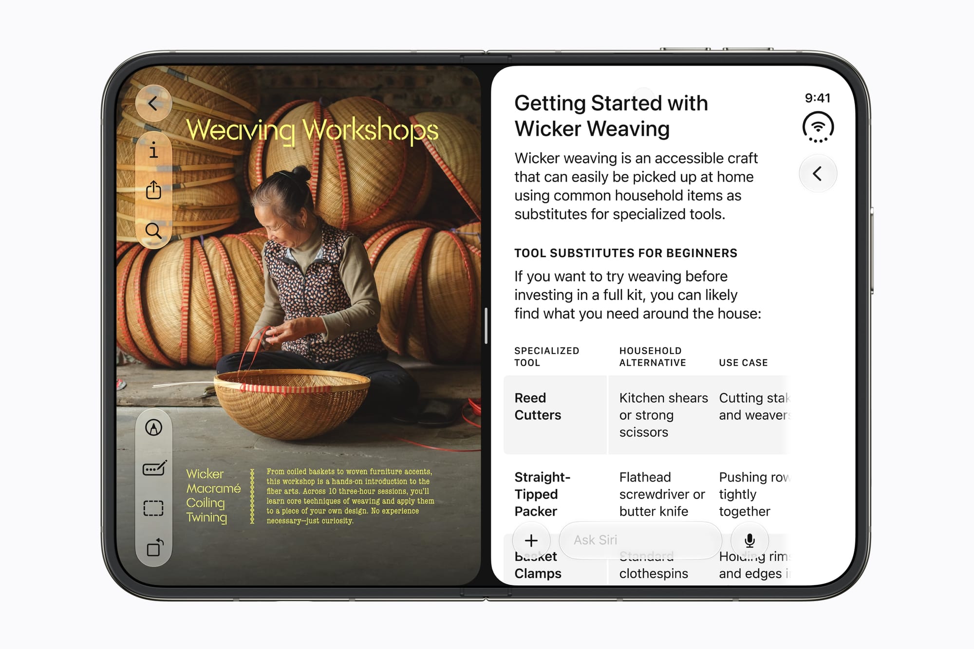
Here is where Apple broke with nineteen years of habit. On the Duo, Lock Screen controls, the Dock, and app navigation move to the side of the screen to free up vertical space. The Dynamic Island turns vertical and runs along the edge, and the status bar shrinks into a circular cluster tucked in the corner.
Apple's design guidelines for the Duo carry that logic into third-party apps. Toolbars, tab bars, and navigation controls shift to the side in every position but one, the inner display held in portrait. In Split View, each app places its controls on its own outer edge, so the left app's buttons sit on the left. Apple tells designers to "reserve the top of the vertical axis for primary navigation controls" such as Back or Close.
From a design standpoint, this is a sound answer to a hard problem. A wide, short canvas punishes top and bottom chrome, because those bars eat the dimension in shortest supply. Moving controls to the edge returns that height to content, and it positions buttons near the thumbs of someone holding what amounts to a small book.
Video via Apple.com
The shift carries a cost. Every iPhone owner has built years of reflex around reaching for the top-left corner to go back. On the Duo, that spot may hold the Back button in one app and nothing at all in the next pose. Muscle memory doesn't respond to good reasoning, so expect a learning curve measured in weeks rather than minutes.
One trade-off in the guidelines deserves more attention than it has gotten. Apple notes that controls with text labels stay in a horizontal bar, and it advises developers to prefer a symbol wherever one works. Icon-only buttons conserve space, and they also obscure meaning. Anyone who has run a usability test has watched people misread an unlabeled glyph. If developers take this advice too far, the Duo could become the most icon-heavy iPhone yet, and the least self-explanatory.
Multitasking with guardrails
The Duo is the first iPhone to run two apps side by side in Split View. You can also open two Safari windows, swap apps in place, keep a Siri conversation going next to other content, and save app pairs to return to later.
What you can't do is resize those panes. AppleMagazine reports that the split is locked at an even 50/50, and The Mac Observer describes the system as simpler and less flexible than multitasking on iPad. Apple's developer talks add one more limit, which is that new windows can only open on the inner display.
I think that restraint is correct. iPadOS spent years cycling through multitasking schemes that confused people, and a 7.6-inch screen has no room for floating windows. Two equal panes with saved pairs is a model you can explain in one sentence. Whether it stays that simple once power users start asking for a 70/30 split is a fight for next year.
Designing around the fold
Apple treats the fold as a layout element instead of a flaw to hide. The guidelines define reserved regions that content should avoid, including the folding area when the device sits partly open. Alerts, menus, and sheets move around the crease on their own, and Apple tells developers to favor an even number of grid columns so content splits cleanly at the hinge. Apple Pencil support for both displays arrives later this year.
The fold also opens up new surfaces for information. Set the Duo down and StandBy runs on either display, off the charger or on it, turning the phone into a desk clock, photo frame, or widget board. The camera borrows the outer screen for subjects in front of the lens. Duo Preview shows subjects their own framing, and Kid Cue plays Peanuts animations to pull a child's eyes toward the lens. Of all the launch features, that last one feels the most like the work of a designer who has tried to photograph a toddler.
The app gap
The weakest link at launch will be third-party software, and the reason comes down to developer timing. Apple's developer talks lay out three tiers. Apps that haven't been rebuilt for iOS 27 still run on the Duo, but they open at a familiar phone size instead of filling the inner screen. Apps built with the iOS 27 SDK reach a little further. Only apps built with the iOS 27.1 SDK extend to the edge of the display.
That SDK landed in beta with Xcode 27.1 on September 18, about five weeks before the phone ships. Crosley reports that App Store Connect began accepting Duo-optimized apps on October 5, with Duo screenshots required for submissions starting in April 2027. Apple has named Netflix, Zoom, and Slack as early adopters. Most of your Home Screen won't be on that list on day one.
Smaller inconsistencies will surface as well. The Duo uses Touch ID in the side button in place of Face ID. Crosley warns that plenty of iPhone-only apps hard-code Face ID into their sign-in prompts and onboarding. Those apps will tell Duo owners to use a sensor their phone doesn't have.
What to watch on October 23
Early hands-on time has been kind to the hardware. AppleInsider's reviewer admitted to worrying that Apple would run ordinary iOS on the outside and a bent version of iPadOS on the inside, and came away convinced Apple had avoided that trap. Apple found a better answer than either easy option.
A good rulebook still leaves room for rough edges. The questions for launch week are practical ones. How long does it take a longtime iPhone user to stop reaching for the top of the screen? How many favorite apps will sit in a phone-sized window in the middle of the inner display? Will icon-only toolbars leave new owners guessing?
The price raises the stakes considerably. TidBITS points out that the same money buys an iPhone 18 Pro and an iPad mini with change left over. The Duo has to beat that pair, and its case rests on the interface more than the hinge. The first test I'd run is the simplest one: open a familiar app and watch where your thumb goes.